On the 2022 Olympics Jackets
The Curling Fashion Expert Has Logged Back On
Well, you knew this had to be coming, right? My previous newsletter about the Scotties jackets got a lot of views and had a lot of opinions being thrown my way. So why not dig in to the biggest curling tournament in the world?
This list will be a bit more interesting to do because the jackets aren’t all designed by one company and are not required (necessarily) to follow a theme or template. Unfortunately, it might also be a bit less interesting because…well, a lot of the jackets simply aren’t all that good. Obviously we are living in strange times where “are these Olympics even going to happen?” was a fairly legitimate question to be asking up until about 2 weeks before they took place. So maybe that’s a factor. But with Dynasty leading the way and teams wearing such creative designs on tour and at the Canadian championships, it was a bit disappointing as a full collection.
But nevertheless, here we go. I’ll be ranking every jacket worn in the curling discipline at the Olympics, choosing the best colour template from each team (every team had at least 2 templates with some having 3).
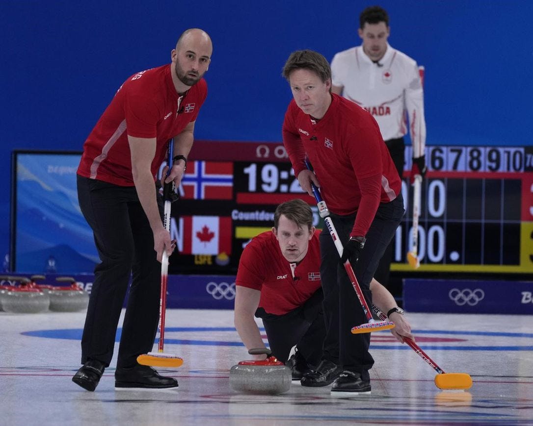
Norway (Designer: Craft Sports; Best Colour: Red)
We’ve come a long way from “The Pants”. This is an understated design already, and then when you couple it with the fact Steffen Walstad opted for the black pants, we really aren’t working with much here. Have you ever heard of Craft Sports? I haven’t. Swedish company, apparently. Big in cross-country skiing and cycling, I’m told. Maybe this is international sabotage, as this kit is as drab as they come.
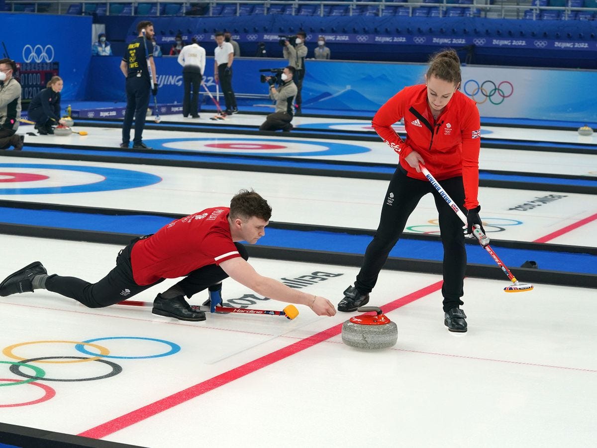
Great Britain (Designer: Adidas; Best Colour: Red)
This is the perfect photo for this newsletter, since you get a decent look at the back and front of this jacket…but it doesn’t really help it. I think Adidas was going for a classic soccer-style England top here, but it comes across looking more like a soccer training kit than one you’d actually see on the pitch. Given how good all the GB teams are (and how good the Foxglide Scotland jackets are), these are a disappointment. Also: the red of the jacket doesn’t match the red of the shirt, for some reason.
Italy (Designer: Fila; Best Colour: White)
It’s a shame Italy couldn’t have been wearing something a little more iconic for their first Olympic medal win (and gold, no less), as borrowing from the GB strategy of mimicking a classic soccer top also doesn’t really pay off here. The blue front shoulder yoke is sort of interesting and I like the Italian flag woven into it, but given the rich history of fashion in Italy, it would’ve been pretty cool to see them wear something a lot more insane than this.
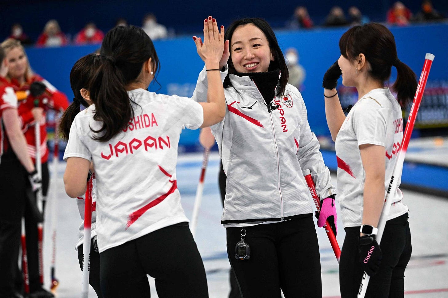
Japan (Designer: Mizuno; Best Colour: White)
One thing I don’t quite understand is why more jacket designs don’t make use of the copious amounts of space on a curling jacket. I totally get it for other sports—the action is moving quickly and small designs and touches don’t show up. But in curling, everything moves at a glacial pace. Small touches are visible everywhere and most teams on the Grand Slam circuit understand this and make use of that space. This is another example of what could have been, as Team Fujisawa have some of the best jackets on tour, using the night sky as inspiration to fill the space and these are just…very white. No image on the back and an alarm clock-style font leave a lot to be desired.
Sweden (Designer: Uniqlo; Best Colour: Yellow)
The classic Sweden yellow is always going to get love from me because it’s such a truly classic design, and I love the Tre Kronor on the back of the shirt. It’s an example of how to use all that real estate, and makes them immediately identifiable as Team Sweden. That said, the front is VERY plain and while I don’t mind the little sleeve touch on the short-sleeve that mimics the Swedish flag, it could be a bit more pronounced. Given that we are still blinded by the brilliance of Sweden’s 2018 gold Closing Ceremonies outfits, we might’ve liked something a little more exciting here.
Czechia (Designer: Atex; Best Colour: White)
I think it is cool they used a Czech company for their jackets and they turned out something pretty damn solid. I like the way the front stripes move over through to the back of the shirt, and I used this photo so you can see the faint outline of the Czech Lion on the back. The Czech shield you often see on the front of their hockey jerseys on the sleeves is also a great touch.
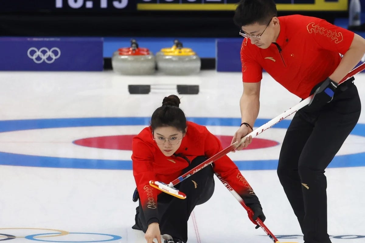
China (Designer: Keep Moving; Best Colour: Red)
This jacket gets a lot of the little things right, as I like the gold-embossed patterns on it and the gold lettering too. It also gets some of the big things wrong: the spacing between the name and the country on the back of the jacket is bizarre, there’s no logo on the back of the jacket that could really make it pop, and the gradient is ultimately a bit lost on the jacket because it ends really low and doesn’t quite filter into the red. That said, it still looks nice, particularly the short-sleeve bicep design.
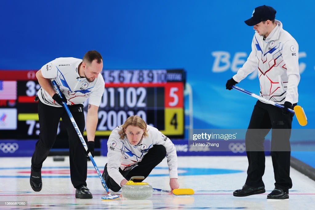
ROC (Designer: Dynasty; Best Colour: White)
ROC was always going to be a bit of a special case considering they’re technically not representing a country. That allowed Dynasty to get a little jiggy with it, coming up with this sort of Transformers-inspired look that I dug a lot. But that said, they were also hamstrung by the rules against ROC and the back is virtually blank with a small namebar and as cool as the Transformer look is, it feels like more of a “Grand Slam” look and less of an Olympic look to me.
USA (Designer: Columbia; Best Color: Light Blue)
The USA unis have been a bit complicated for several reasons: one, the Nike uniforms for 97% of the time they clothed the States were dreadful. The US curlers had to wear them on tour and I always felt bad because they were insanely ugly, navy blue and white things that looked thrown together. But then the US had a pretty iconic look in 2018, as they switched to the light blue with the grey pants and then won a gold medal wearing it and we were forced to think “hey, ok, maybe we are on to something here”. This first foray with Columbia is just a tad too busy for my liking, with stripes cascading all over the place, a gradient, stars falling down the front, and then just a big ol’ flag in the middle of the back. The kit is already very America-centric, the flag seems like an unnecessary touch. And it seems both teams favoured the navy blue version of this kit, which I thought was worse. All that said, I love this sky blue colour, I do like the stripes that run up the shoulders and around the body, and the “USA” logo just below the flag is really good. This feels 70% of the way there and given Columbia just came on board, I think we’re gonna see some great designs ahead.
Korea (Designer: Maple; Best Colour: Navy Blue)
I don’t know what “Maple” is, but this is a very clever design, incorporating the swirl from the Taegeuk on the flag into the overall jacket design, as well as each of the 4 trigrams from the flag on the shoulders. Add in the gold matte lettering (a proponent I think should be used FAR more often in curling), and this is a great template for how to do a “classic”-style uniform where it’s not too busy, but has enough subtle touches to be unique and instantly recognizable as belonging to a particular country.
Denmark (Designer: Foxglide; Best Colour: Black)
I generally find black curling jackets to be overdone, but these Danish ones absolutely hit the mark. I wish Foxglide got a bit more involved in this event, because I love their stuff and these are no exception. So many great touches from the Olympic Torch logo on the left front and right shoulder to the World Cup-inspired gold writing identifying the Olympics date on the right chest to the subtle gradient through the even subtler honeycomb pattern to the gorgeous crown logo on the back, these jackets balance everything perfectly and are the start of the Elite tier of jackets at this event. (Added bonus: Madeline Dupont and her husband designed the third women’s jacket, a white number with a collar that also looks very cool)
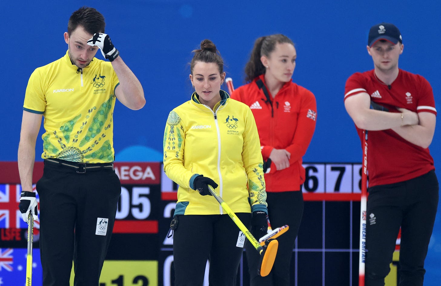
Australia (Designer: Karbon; Best Colour: Yellow)
I just absolutely love that this was Australia’s first foray onto the Olympic stage, and their jackets were instantly and iconically Australian. Because curling kits are often designed by a company that doesn’t design the rest of the nation’s gear, sometimes curling teams can feel a bit disconnected but this fits in beautifully with what you’d think is the best of Australian uniforms: bright yellow, that lovely green, and then to top it all off, some intricate Indigenous design that really pops. I also love that the design touches are on the sleeves of the jacket but the torso of the short-sleeve. Just so well-done. And it makes sense that it’s very well done, because the design was in fact handled by Foxglide. Karbon was a main sponsor of the team, so Foxglide handled the design and Karbon handled the production (and got the logo).
My only VERY minor complaint is they didn’t co-opt their kangaroo logo from the Trials to the back of these ones. Had they done that, these could’ve been your #1.
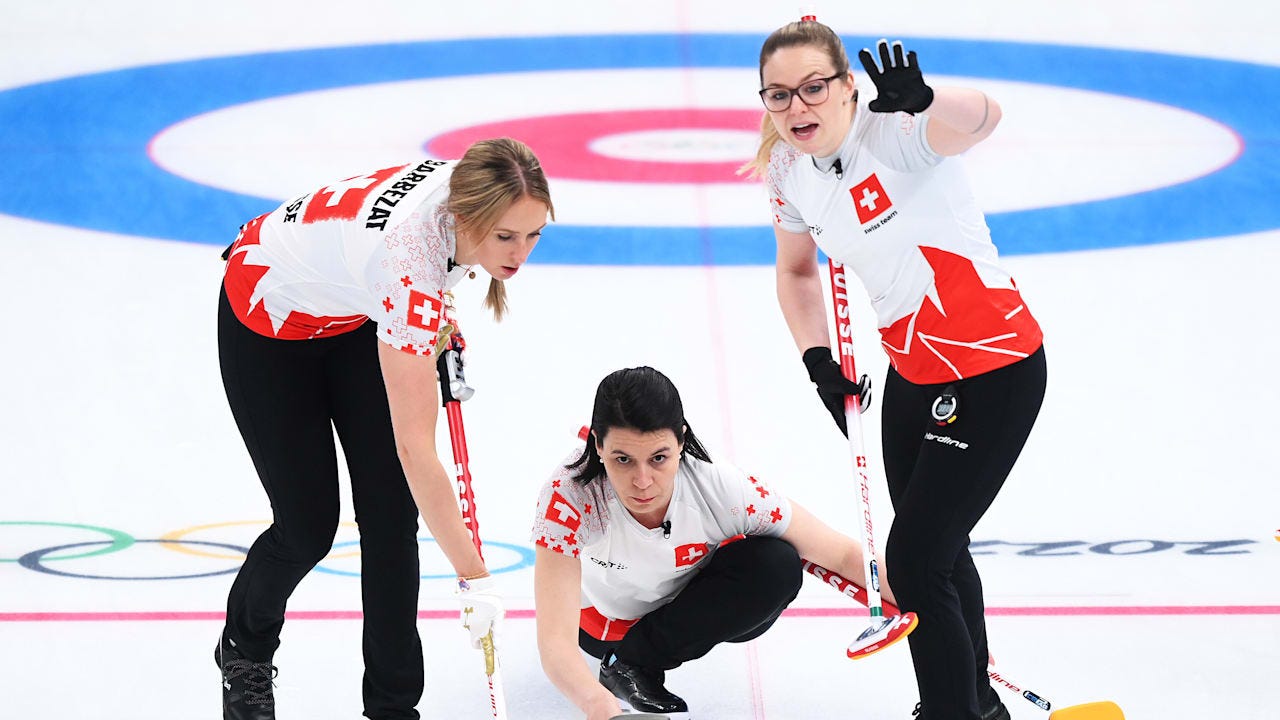
Switzerland (Designer: Craft Sports; Best Colour: White)
Everything Craft Sports got wrong about the Norwegian jackets they got right here, as these have everything you’d want in a curling uniform. Of course the Red Cross is such an iconic logo, but it’s put to good use here, as I love the huge logo-size version of it on the back, especially given that they gave it a little spray-painted edge so it doesn’t seem like a perfect square. Then of course you have the little red crosses scattered on the shoulders of alternating colours. And THEN the tribute to the Swiss Alps rising from the bottom of the tops is just, well, the tops. It’s not too much in any direction and everything comes together beautifully. Even the font is perfect. Plus, they made this incredible little uniform reveal video that way more curling teams should do.
Canada (Designer: Dynasty; Best Colour: White)
Yeah yeah, home country bias, blah blah. These are just nailed in every aspect. The feathers on the side body, the Indigenous-designed Maple Leaf logo, the diagonal stripes that meet up on the sides and frame the back? Oh yeah. I like them a LOT. The font? Perfect. Even the little maple leaves on the shoulder caps work (though I think they look best on the white where the grey makes them a touch more subtle). I am a sucker for Indigenous art, but I do think these are probably the best Team Canada jackets we’ve ever had. My only very small gripe is that the “CANADA” on the front is maybe a bit too low. I understand it’s gotta to line up with the stripes, but I think it would’ve looked better a shade higher on the chest, rather than where it sits now, which is closer to the abdomen (or in my case, belly) region. Other than that? No notes. Great work, everyone.
What were your favourite Olympic jackets? Let me know in the comments or on Twitter at @cullenoncurling.

