On the 2022 Scotties Jackets
Curling's Foremost Fashion Critic is Back!
Hello again. I asked for some mailbag questions at midnight PST last night, so not the ideal time for it, but I did get one that sparked some joy in me:
As some of you may know if you’ve followed me on Twitter for a while, I have long felt that curling fashion has lagged behind how great our game is, particularly at the national level, where teams were handcuffed into wearing provincial uniforms that were either bad, plain, or ill-fitting (or a combination of all 3) for a large portion of the 21st Century.
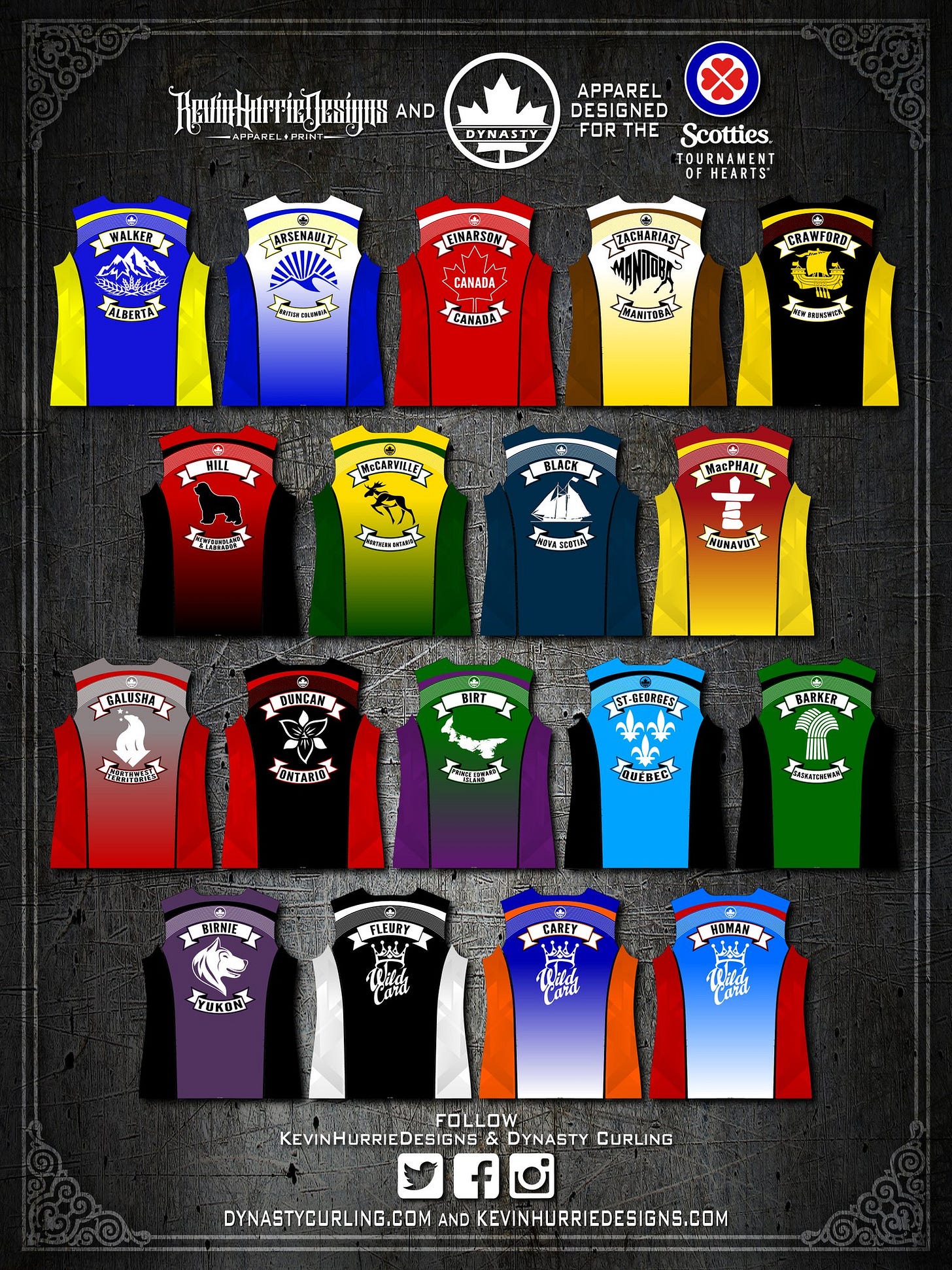
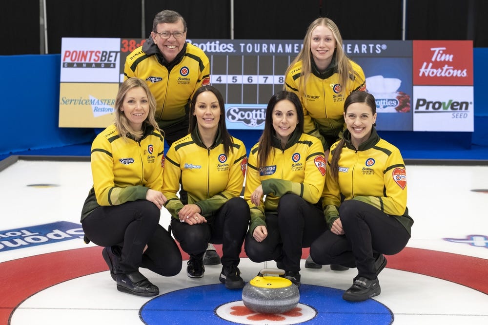
While my days of rating jackets on Twitter are gone, I saw this question and thought with all the great stuff Dynasty has done over the past few years, it might be time for an official OFFICIAL jacket ranking of the 2022 Scotties jackets. It’s the first year they’ve introduced a gradient to the mix, and I think it’s absolutely for the best. So where does every team stack up?
I should also note that I think all of the jackets are good. Not a single bad one. If I was representing my province, I would be thrilled to wear any of these uniforms. I think Dynasty and Kevin Hurrie have done a tremendous job bringing the jackets forward into the modern times. I think the name bar/provincial banner surrounding the provincial logo is perfect, I think most of the provincial emblems are now exactly what they should be, and I really love the line of little stripes underneath the shoulder yoke, which add a lot to each jacket. Overall, I just think they’re great. But great things can still be ranked! Here we go!
Wild Card 1
Look, these jackets aren’t BAD or anything, but at the end of the day, it’s a black and white jacket. There’s only so much we can do here.
Ontario
This is a jacket that would have benefitted GREATLY from being gradient-ed (not a word, I know). The Trillium logo is one of the strongest, but black/red is the most overdone combo in sports.
Saskatchewan
This jacket needs some yellow. The Saskatchewan flag is half yellow and I understand you’re already using green/gold for Northern Ontario, but there had to be a way to get some yellow in here. I also tend to think of Saskatchewan as more of a Kelly green, as opposed to the Hunter/Forest green we see here.
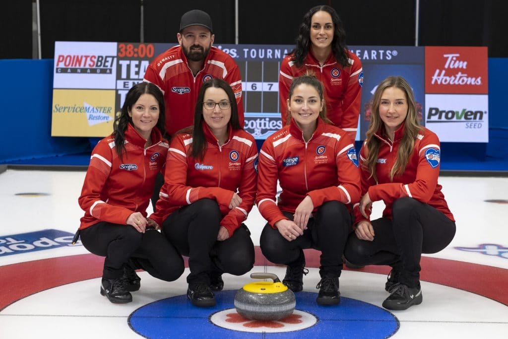
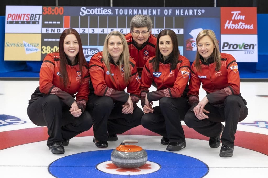
Canada
It’s the nature of the business, but when the best Canada jacket we’ve ever had is currently being sported at the Olympics (and will be worn at Worlds too, I believe), this one doesn’t hold up as well. Also the way the white accents the red makes it look more like a Newfoundland jacket, to me.
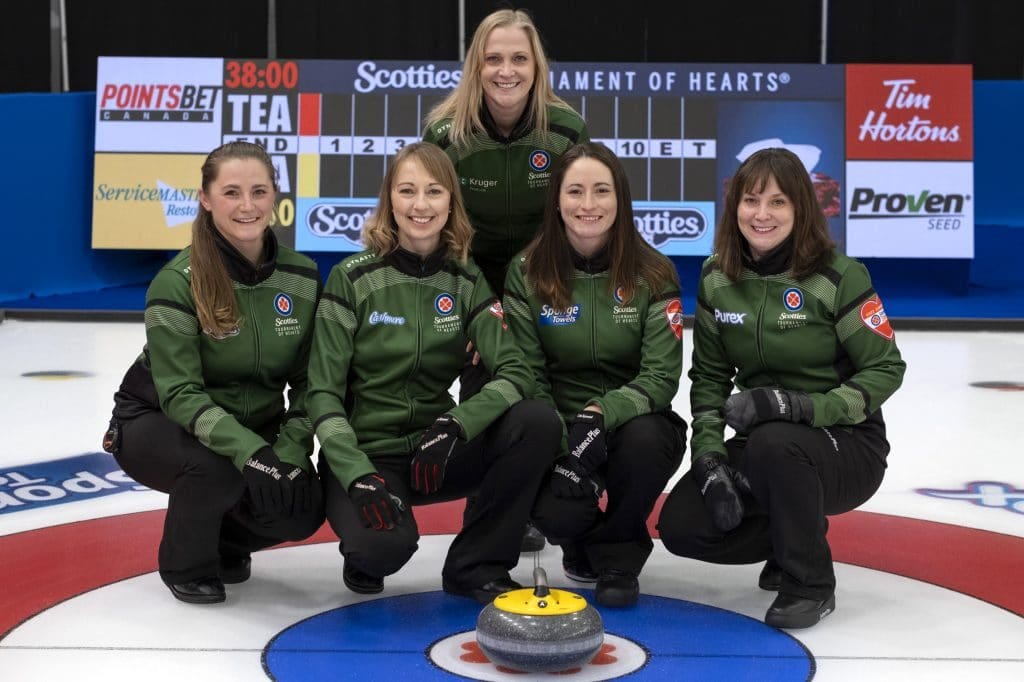
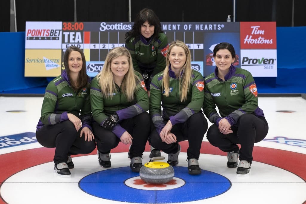
Prince Edward Island
I LOVE purple on curling jackets, but there’s just something about the way it combines with the green that I don’t love as much. Plus this ranking is at least partly in protest over the fact that PEI’s provincial curling association won’t let their logo be a potato.
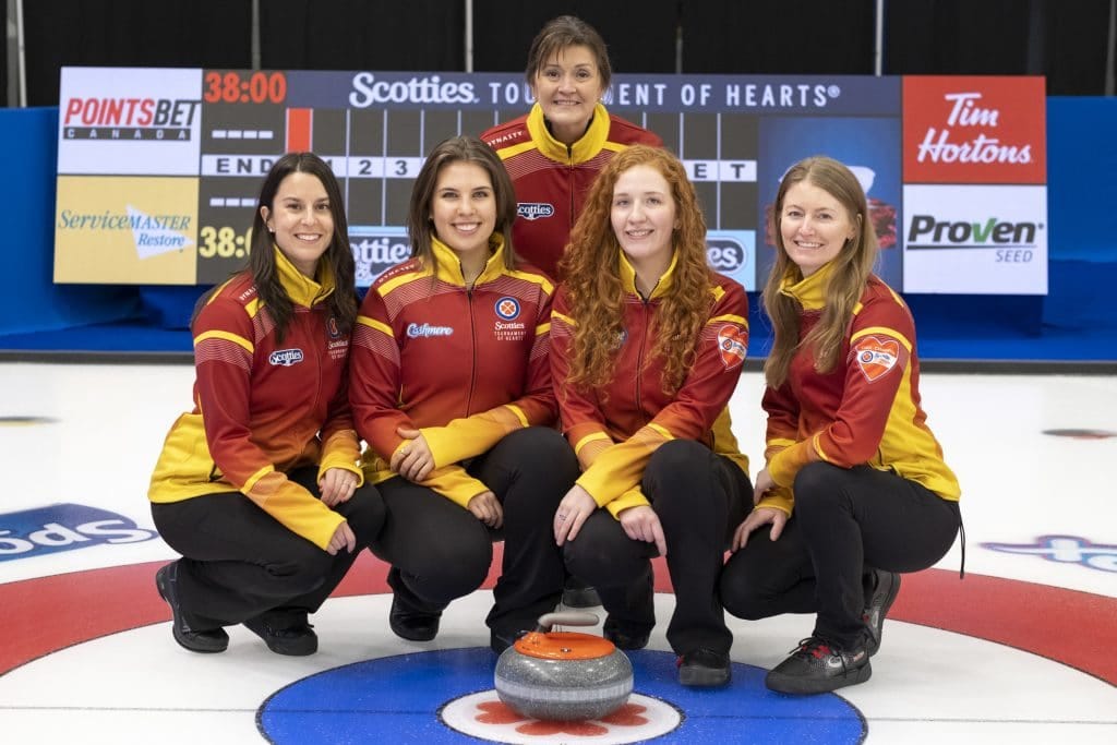
Nunavut
I know that it borrows from the Inukshuk on their provincial flag, but I’ve never been enamoured with this sort of rust-red the Nunavut jackets have incorporated since their outset. That said, this shade of yellow (let’s call it marigold?) being a bigger part of it with the gradient helps it a great deal.
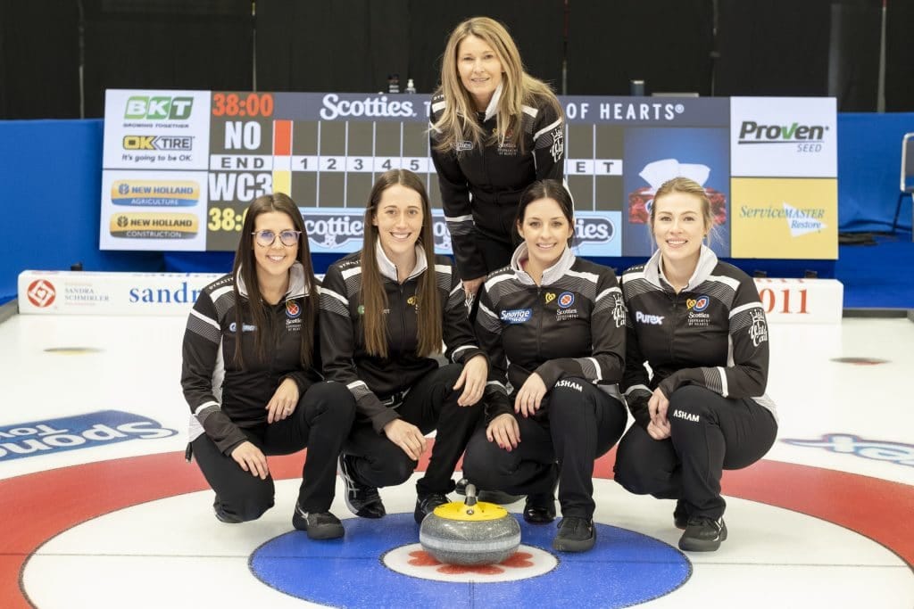
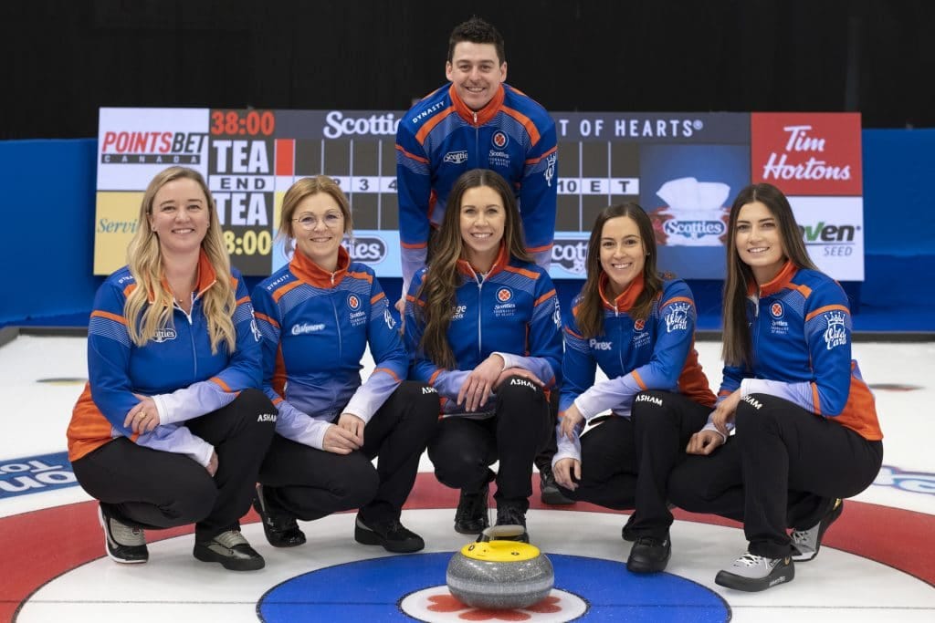
Wild Card 2
I wish the WC2 and WC3 jackets had a bit more differentiation, as they’re essentially the same jacket but with a blue shade change. This is my less-favourite of the two blues, and Dynasty/Curling Canada, I’m once again begging you for a pink/black Wild Card jacket.
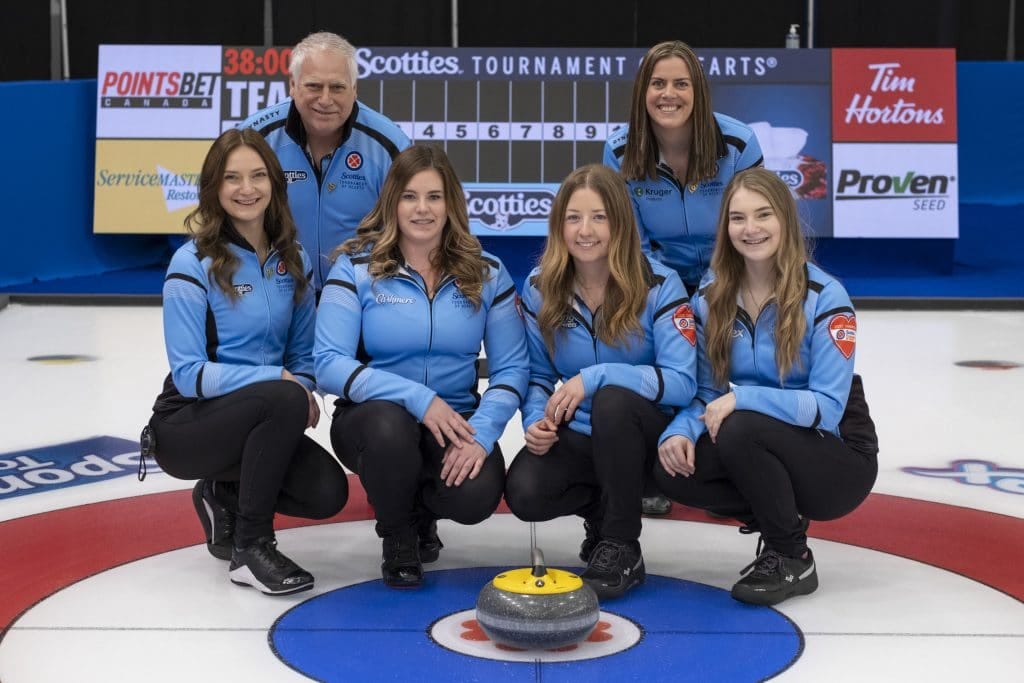
Quebec
The shade of blue utilized in the Quebec jacket has changed over the years, and this is among the best, particularly for a ladies’ team. The powder blue pops really nicely, especially in comparison to some of the jacket tragedies in Quebec’s Scotties past.
New Brunswick
Black and yellow is such a classic combination that Wiz Khalifa wrote an entire song about it. It always looks good in curling, and the full boat is a great logo for New Brunswick. It just doesn’t have a huge factor to set it apart, and I wonder if a yellow gradient might’ve really done it.
Newfoundland
It’s the red and black issue once again, and I do wonder if some more white might’ve helped this jacket go a little better. It’s honestly only ranked this high because the Newfoundland Growler logo continues to be the best of the best.
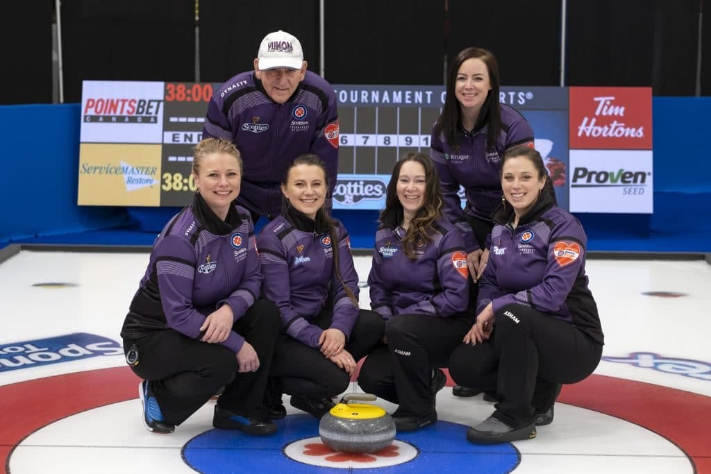
Yukon
As I have said, I’m very biased towards purple as a jacket colour, and while this isn’t my favourite shade of it, it still stands out relative to a field filled with blues, blacks, and reds. Plus, the wolf logo reliably kicks ass.
Nova Scotia
I don’t know what it is, but this shade of navy blue is just perfect for curling. I don’t generally think of navy blue as any sort of exciting colour, but this shade that Dynasty’s been using is simply perfect. It’s a bit more blue-forward than NS jackets of the past (that were nearly black), and the Bluenose logo makes it feel very distinctly Nova Scotian.
Northwest Territories
Now, I’ve taken some flak in the past (mostly from Kerry Galusha herself) about being critical of the NWT grey, but THIS is how you make that grey work. This is the best NWT jacket ever and it’s not even close. Mixing the gradient red in there makes the grey actually pop, and the polar bear logo is also very regal.
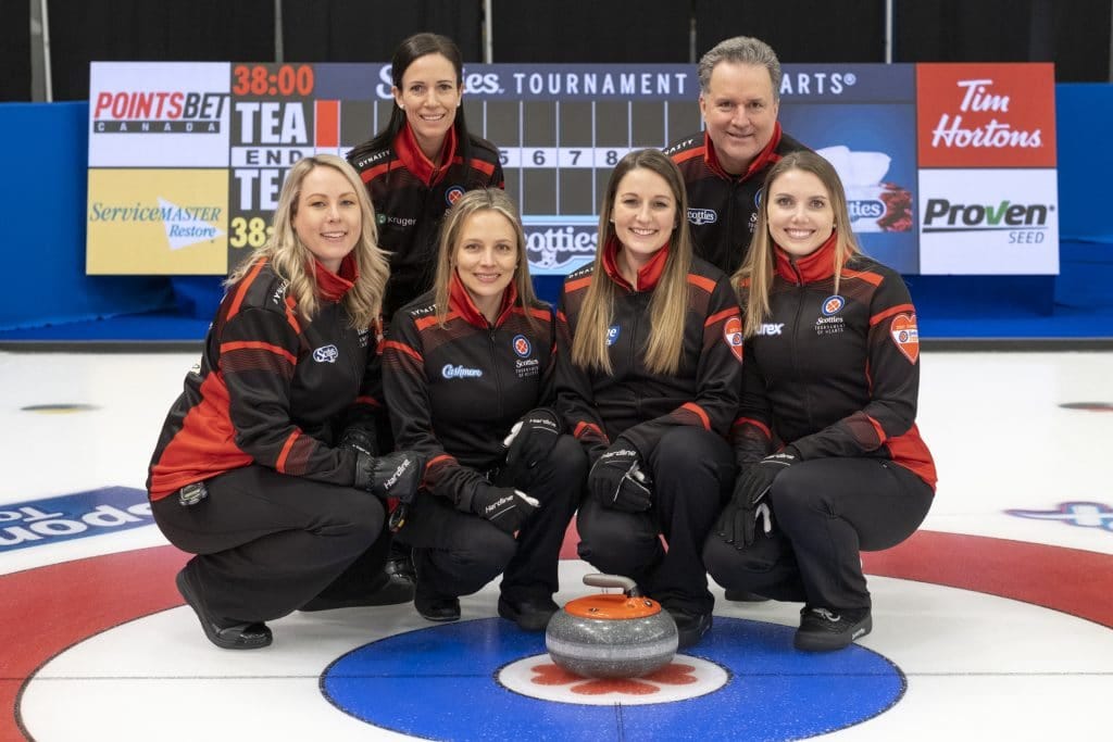
Wild Card 3
This is just a beautiful shade of blue. There’s no other way of putting it. It immediately stands out on the curling ice and the white-ish gradient makes it pop even more. The red isn’t overused, and this blue is honestly a colour that I wonder if some ladies’ teams (or hell, men’s too) will copy next season because we don’t see it often and it works beautifully here.
British Columbia
Yeah yeah, provincial bias, whatever, whatever. This is the way you make four colours work. Having the white up top makes the lighter blue gradient really stand out, and the addition of the darker blue on the underarm panels and collar really ties it all together. The use of the subtle yellow on the under-yoke/bicep stripes is also perfect and it really just stands out, especially in a field where most of the jackets mostly utilize two colours.
Alberta
I suppose your mileage on the Alberta jacket depends on how much you like blue and yellow together, because there’s no gradient here, no dramatic use of a third colour, and no real small touches that make it stand out in particular. But there’s just something about this combo of blue and yellow that has made me fall for the Alberta jackets in recent years, and the addition of the wild rose as the logo puts it way up there for me. I actually think this is almost like the “classic jersey” of the Scotties. You know how the Montreal Canadiens and Boston Bruins and Toronto Maple Leafs are always near the top “best of NHL jersey” lists because despite being somewhat basic, they stand the test of time? These feel like that. They just hit home.
Northern Ontario
Despite being curling’s foremost fashion expert, it’s very rare I tune into a curling broadcast and am audibly wowed by the uniforms. Watching the opening draw of the 2022 Scotties was one time where that absolutely happened to me. In the past, NO has been typically using green as the main colour, and switching to a main yellow with a green gradient just sets these jackets ALL the way apart, while still retaining a connection to the Northern Ontario jackets of years past. I wouldn’t be surprised if Kevin Hurrie came up with the idea for gradients starting from this jacket, because this is the perfect use of it. And of course, the moose logo is absolutely iconic.
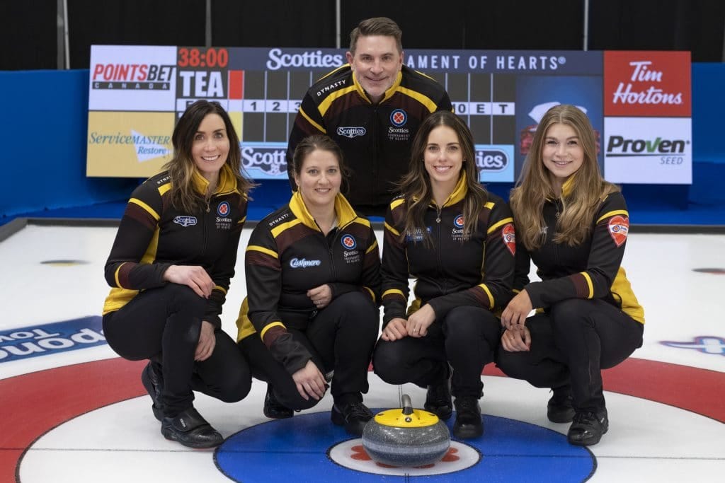
Manitoba
The brown is beautiful, and it is perfect. I know Carly Howard vehemently disagrees with me, but this jacket is just…it’s just so good. The brown makes this yellow absolutely stand out in a way that the blue does for the BC jacket, while being a completely unique colour that somehow seems to fit Manitoba as a province. It’s not too much but it’s not too little either. Brown is a colour that a designer could be afraid of, and just splash a tiny bit of on a jacket to test the waters. It’s not so here. It’s exactly the right amount that screams classic curling style while being also thoroughly modern. The switch back to the “MANITOBA” buffalo on the back rather than the silhouette of years past was also an inspired move by Dynasty and this is where is all comes together. Being from a non-Manitoba province, I understand how it feels to pump the province of Manitoba’s tires (they do not need the encouragement), but this jacket is too good to deny.
What are your favourites? Let me know in the comments! Give me a follow on Twitter at @cullenoncurling, and make sure to subscribe to you get the newsletters delivered directly to your inbox as soon as they’re published!


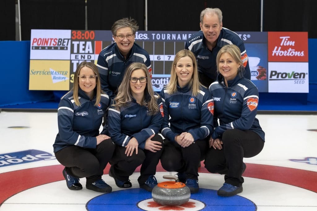
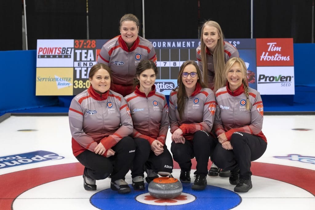
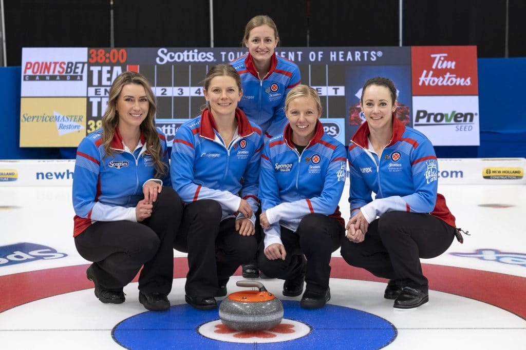
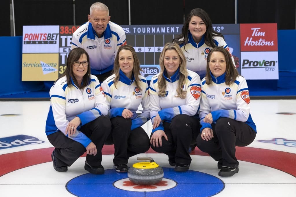


1) Alberta
2) Nunavut
3) Prince Edward Island
4) Nova Scotia
LOL don't agree at all your #18 is in my Top 5