On the 2026 Olympic Jackets
Curling's fashion expert is back.

You know I had to do it to ‘em. It’s been a while since I’ve been here on this ol’ newsletter, and while the Olympics always brings up a lot of discourse (particularly this Olympics, my goodness), there is certainly nothing more important than what happens on the ice, and specifically, nothing more important than what these teams are wearing. Every 4 years, we get a chance to see our game showcased on the highest stage, and every 4 years, some teams make their mark more than others when it comes to fashion. It’s always an interesting push-and-pull, as how teams come to wear these jackets and shirts varies wildly. For some countries, they are forced into wearing the clothes of a designer that maybe doesn’t care all that much about curling, only showing up every 4 years to begrudgingly design their kit. For other countries, their players themselves literally design the jacket. As you will see here, that leads to designs of wildly varying quality, and I’m here to rank them all for your reading pleasure.
Please note, while I will state what I think was every team’s BEST individual jacket/colourway, the teams are being ranked on their jacket set as a whole, including all colours and all jackets/shirts. Let’s dive in.
Great Britain (Designer: Adidas; Best Colour: Navy)
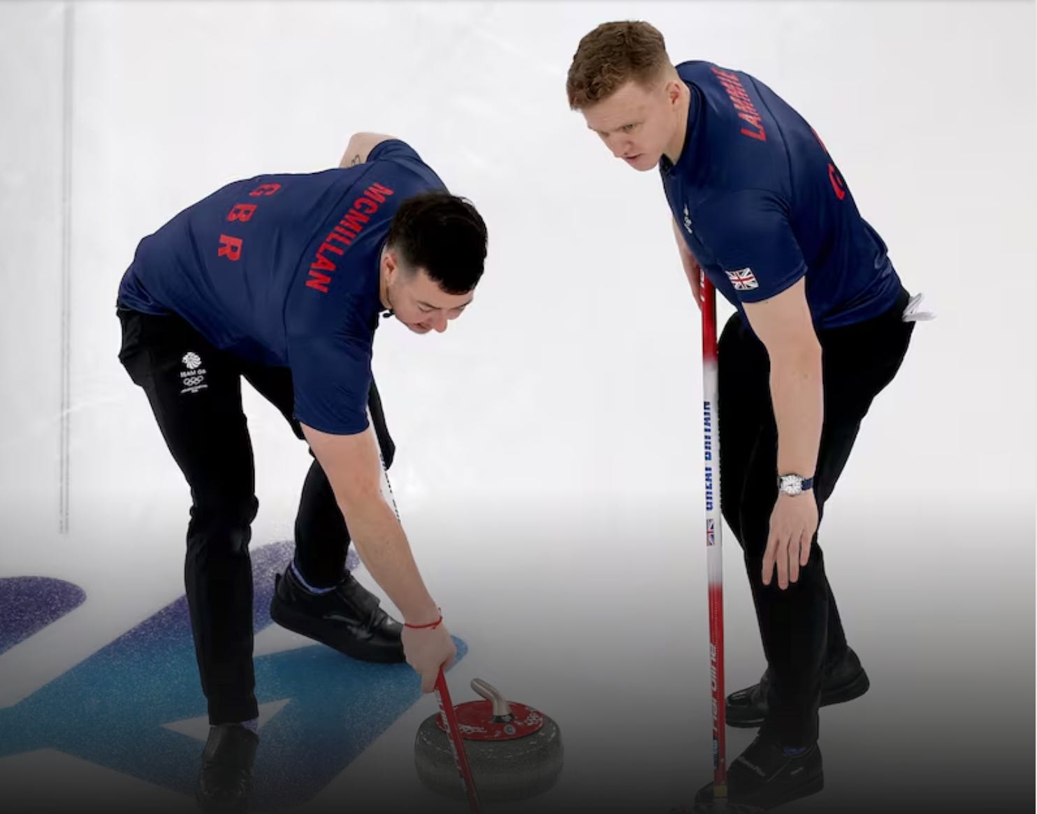
From what I understand, Great Britain is not exactly a Winter Olympics powerhouse. They picked up a few medals in skeleton, but they mostly rely on curling to bring in a medal haul every quadrennial. And uhh…they know Team Mouat is the #1 team in the world right? Considering Adidas is one of the world’s top sports apparel brands, I have no clue how they failed to meet the moment and get their #1-ranked team in something better than this tossed-off disaster. I know GB’s whole thing is simple patterns—the English soccer team is a great example—but these feel extremely low-effort. And don’t even get me started on the vertical “GREAT BRITAIN” below the Adidas logo. If you’re going for “plain and classy”, you can’t also throw that in there. But the front isn’t even the main problem: I mostly chose this photo because it’s the back of the shirts that really got me. What’s with the giant space between the player’s name and the simple “GBR” below it? It’s like they made space for a logo and then never put it in and makes the “GBR” look like its floating, out of place. Considering how nice the off-ice kit was (seriously, get me one of these baby blue jumpers or baby pink fleece, stat), this was a real tough look.
Norway (Designer: Craft; Best Colour: ???)
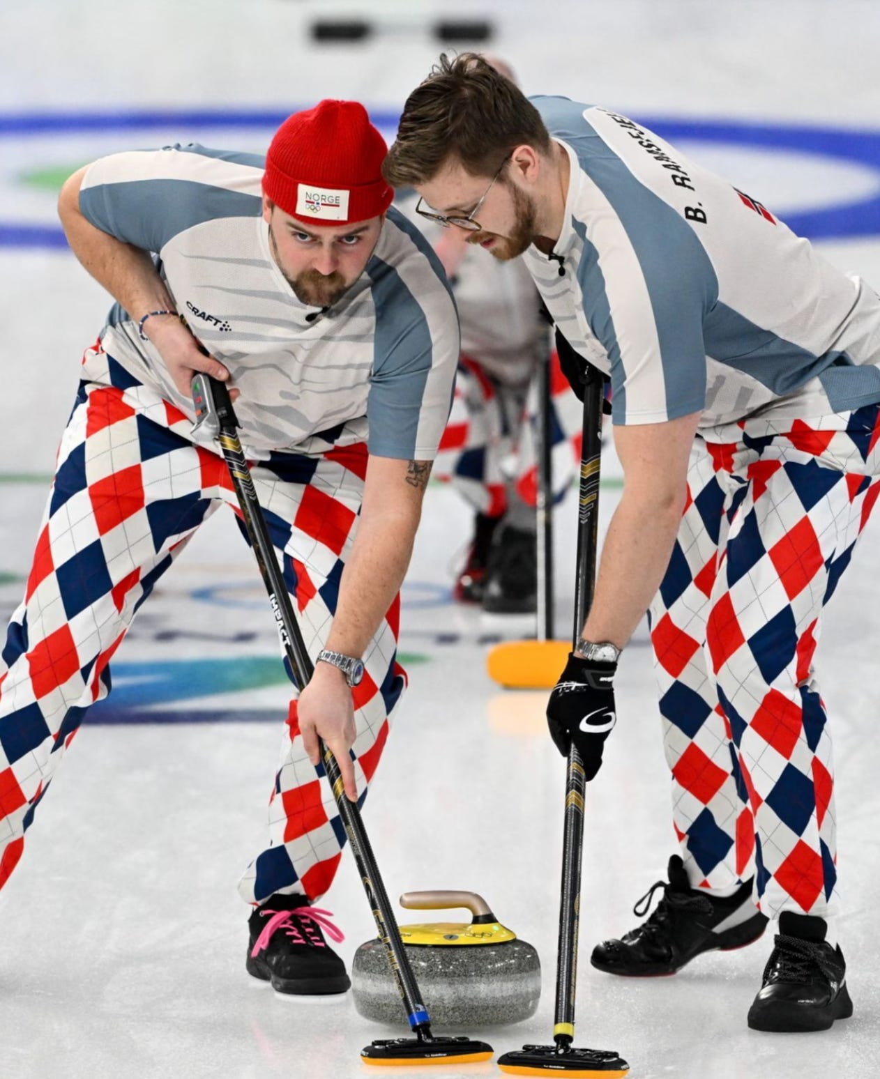
I know when I think of Norway, I think of the colours of cream and grey. I mean, what were these? The design on the front made no sense to the overall theme, I don’t like the dual colours on the shoulder yoke, and the tiny Norwegian flag on the reverse made me feel like they added that at the last minute because they thought, “shoot, we should probably remind people these curlers are playing for Norway because these colours won’t do that”. These were easily the worst shirts and jackets of the Games by a LOT, and it’s really unfortunate because of how great their ski suits looked and the fact that their off-ice kit was done by Dale of Norway and had some truly incredible Nordic sweater pieces. If they’re the worst, how are they second-last, you ask? They move up one spot ahead of GB because Team Ramsfjell paid tribute to the passing of Thomas Ulsrud by bringing the pants back for a single game. People argued they should’ve worn them more, but I thought it was perfect.
Japan (Designer: Mizuno; Best Colour: White)
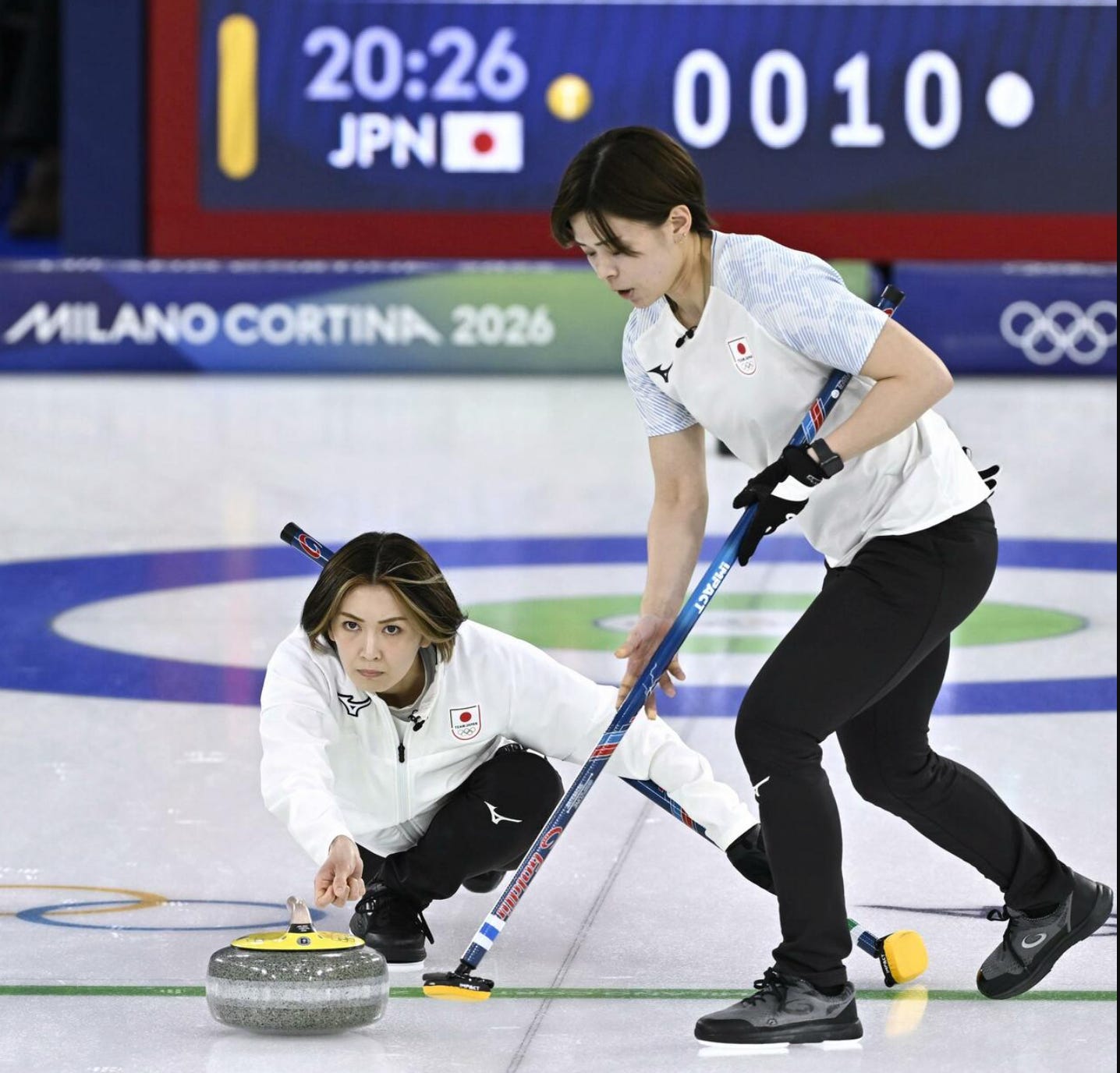
How it is that the kit the Japanese women wore at the Olympic Qualifying Event was MILES better than what they wore here? I can’t understand it. These were boring with a capital B, from the all-white and all-black jackets with no details whatsoever to the shirts that used a weirdly blurred font for the word “JAPAN” on the back. The whites get a slight tick up because I liked the shoulder yoke a decent amount. I initially thought on first glance that it was sakura (cherry blossoms) on the yoke, and I was prepared to move these up a couple notches. Then I saw it was digital camo. No thank you. I like the colour of it, it combines nicely with the white, but that’s about the only redeeming quality of this set.
China (Designer: Keep Moving; Best Colour: White)
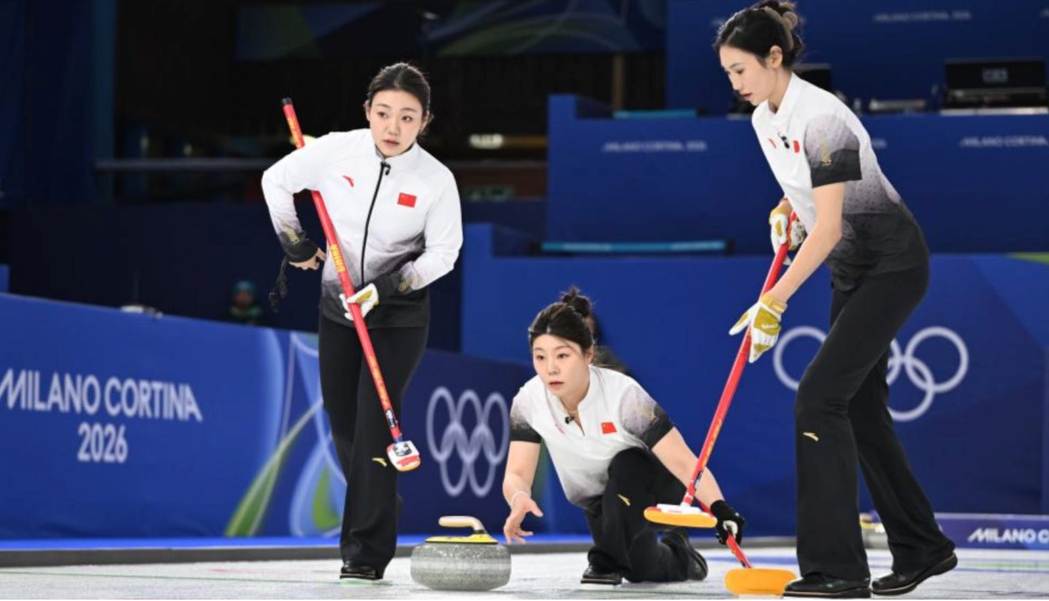
I liked the gradient on China’s Olympic jackets. Last Olympics. The fact that both the Chinese men’s and women’s teams have made real strides in the world game recently, winning World Bronzes and Pan-Continental Championships, made me hopeful that they would come up with a really nice kit here to reflect their status as an emerging player on the curling scene. Unfortunately, it’s almost an exact repeat of the kit they used 4 years ago, and the gradient has grown stale since. The white/black combo is nice, but I don’t love that the gradient goes all the way to the sleeve on the shirts, and some of the details I really liked from the jackets four years ago, like the gold patterning on the sleeves, is all gone here. These are fine but nothing more.
Korea (Designer: Black Yak; Best Colour: White)
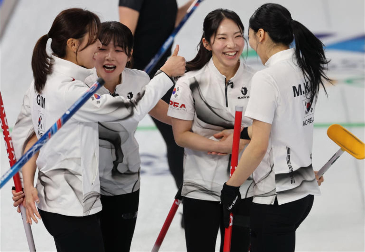
Another case where a team has worn better jackets on the world stage quite recently and who had a very nice kit back in 2022, but missed the mark here. They got a premium sponsor in one of South Korea’s leading outerwear manufacturers, Black Yak, and unfortunately, Black Yak didn’t do all that much with it. I really like the bold font on the back for the name and I like the Korean flag and detail on the sleeve, but I have to admit this sorta wispy pattern all over the jacket isn’t really doing it for me. It looks even worse on the navy jacket than it does the white, and it doesn’t look good here either. I like the nod to the Korean flag with the trigrams just down the left of the back of the jersey but ultimately this falls pretty short and doesn’t feel like any sort of iconic Olympic strip.
Sweden (Designer: Uniqlo; Best Colour: Yellow)
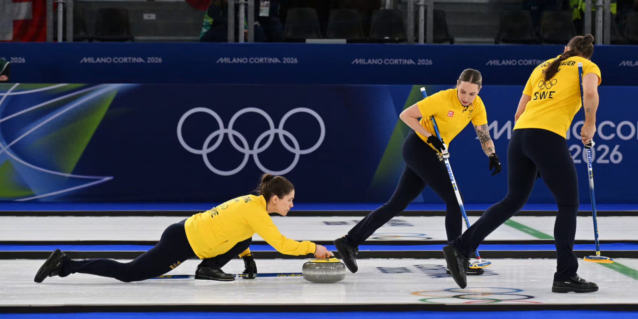
Speaking of identical kits to last Olympics, here we have the Swedes. Look, I do really like the Tre Kronor, and I love the yellow. It’s instantly identifiable, no other nation uses yellow so prominently in their colourway, and the jackets are in lockstep with Sweden’s hockey and soccer teams, which not every curling nation attempts. That said, I do think there’s a bit of a tendency to lean on the Tre Kronor’s iconic status and not shoot for much more outside of that. Uniqlo has come up with some truly unique designs for the off-ice kit and they’re a big player in world fashion. So I’d kinda love if they’d try something crazy, even if it’s just for a third kit, rather than taking the easy way out. These are even simpler than last time, where they had a Swedish flag loop on the cuff of the sleeves which I quite liked. These are efficient, they immediately scream “SWEDEN”, and they are not bad. But I like to live on the wild side.
USA (Designer: Columbia; Best Colour: White)
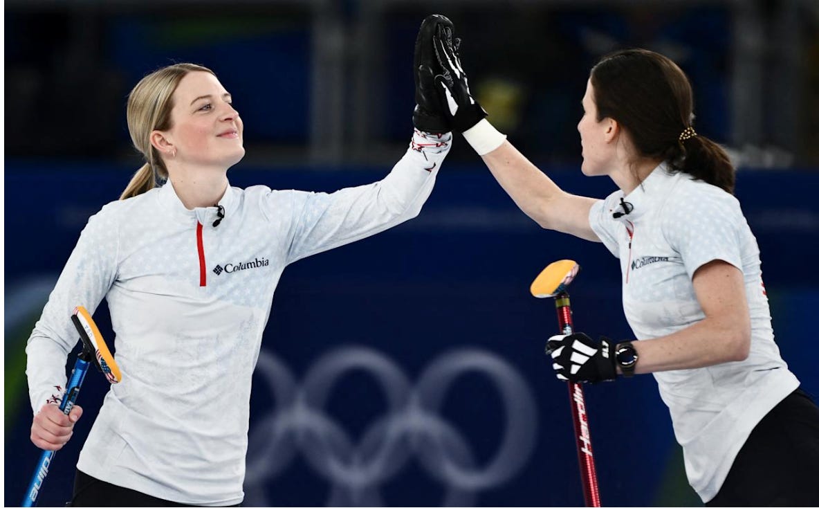
This is the second Olympics for Columbia as the designer of the US jackets and I gave them a bit of a pass last time for veering too much into AMERICA mode because they got the contract about a year before the last Olympics. Well, this time they had 4 years to learn from their mistakes, and largely did not. I said earlier I like to live on the wild side, but there’s a such thing as too wild. The white jackets were pretty nice because the gradient and colour blend sorta masked how busy they were, and I didn’t mind the star pattern on the shoulder yokes or the ones at the bottom of the long sleeves in this colour. The red zipper was a nice touch. The white could be a top 5-ish jacket in the tournament, but the red/blue colourway was one of the worst jackets in the entire tournament, and dragged the whole thing down. Neither the red nor the sorta “steel blue” were great colours and they were just so damn busy, with a rock face that was so washed out you couldn’t really tell what it was, an eagle soaring, and the fact you really realize just how many stars are on this friggin’ thing when they’re contrasted against a darker colour. So. Many. Stars. And I really didn’t care for the “USA” logo on the back where each letter was a different font.
Estonia (Designer: Trimtex; Best Colour: Blue)
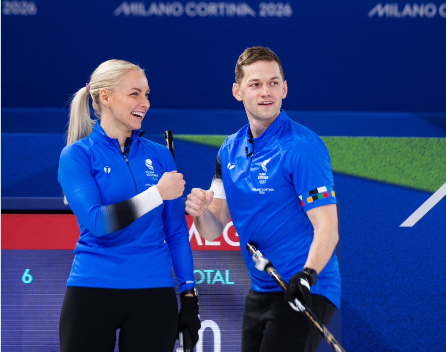
This is strictly what we would call a “Pantone selection”, as that shade of blue looks SO sharp on the curling ice, it instantly stands out. These are definitely on the simpler side and reminiscent of a really nice but basic soccer jersey, but the shade of blue makes them look so clean, and I love the small details, like the one sleeve bleeding into the colours of the Estonian flag, and the two rings of squares on the other sleeve, one of which was the Estonian flag colours repeated, and the other the 5 colours of the Olympic rings. Classy touch. I also really liked the back, as there wasn’t an ounce of real estate wasted, they used a really clean font, and featured the Estonian Olympic logo (and the rings) proudly, which is fitting for their first time being featured in the curling events at the Games.
Czechia (Designer: Alpine Pro; Best Colour: Navy Blue)
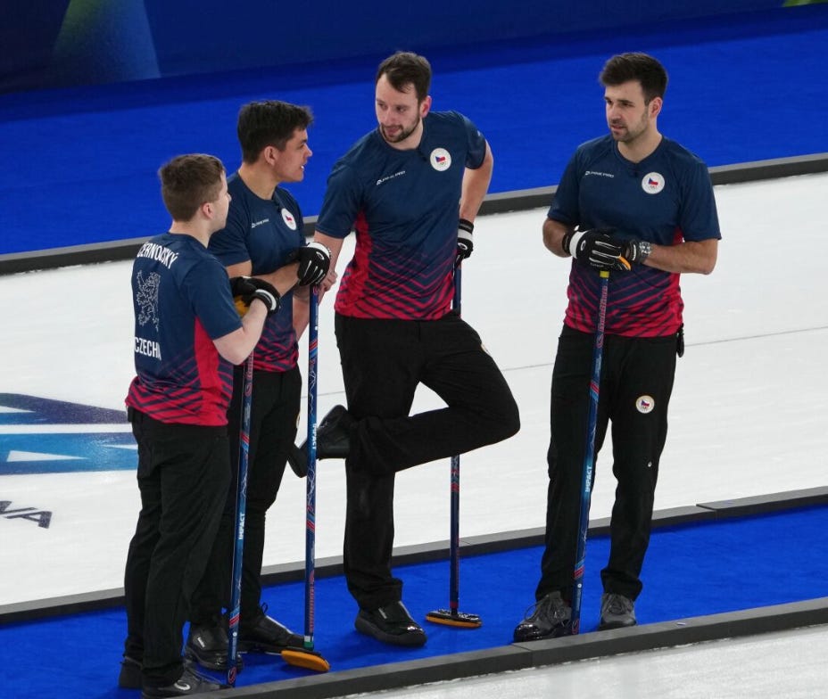
The Czechs are always going to have a benefit with their jerseys, and that benefit is that they have one of the coolest country logos of anyone. It helps their hockey jerseys, and it helps their curling jerseys too, as the Czech lion looks badass as hell in the middle of a curling jersey. This is also how you do geometric without going too basic, and how you elevate a jacket from simplistic without overcomplicating it. The consistent pattern that continues around the sides to form a mirror on front and back, the solid side-body stripe, and the contrast of this navy to this bright-ish red really suits. Tough to have complaints here.
Italy (Designer: Fila; Best Colour: White)
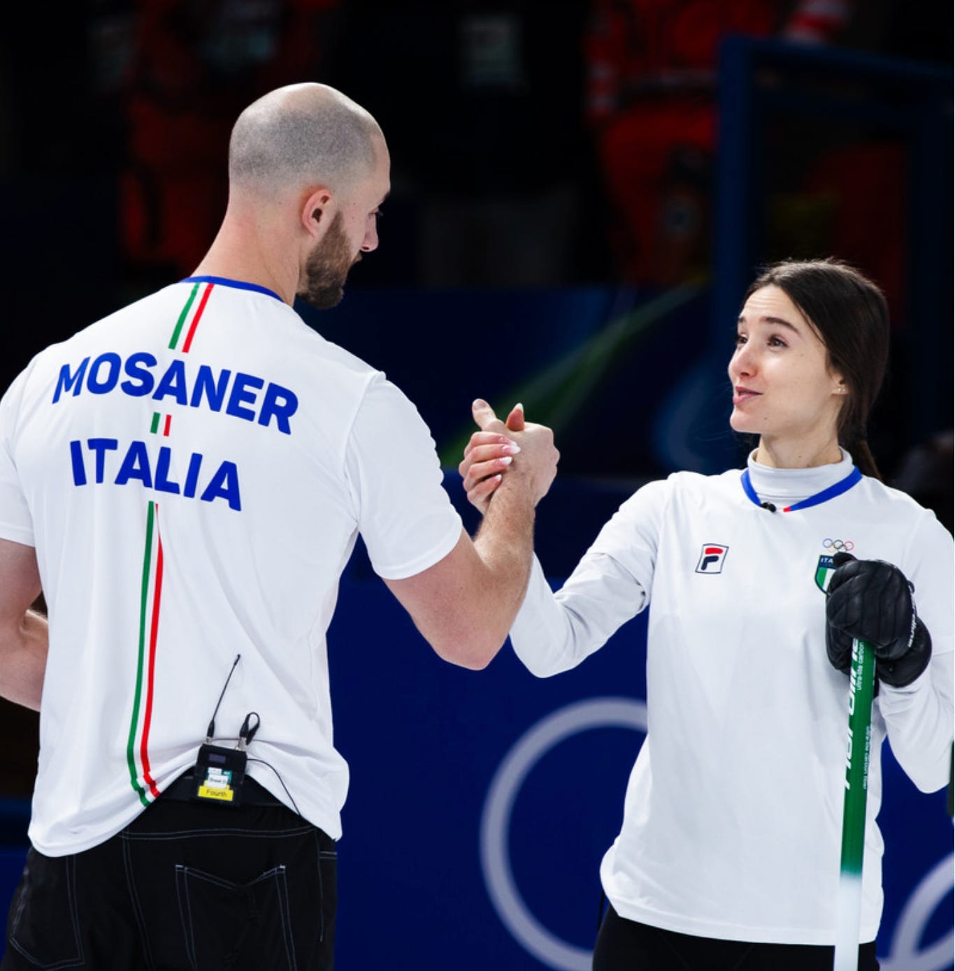
THIS is how you do simple. Look, some countries DO just benefit from having an iconic soccer jersey to pull inspiration from, and these are just absolutely clean as hell. Curling has had a longstanding problem trying to sell on-ice jerseys because they’re often a bit too busy, a bit too NASCAR-looking, or just a bit too ugly to wear outside of a curling rink. These? These you could sell. If they were just plain white they wouldn’t go at all, but the Italian flag racing stripe down the back absolutely pops (and is a nice nod to the country’s carmaking history), as does the subtle blue collar. And the font? Bellissima. If I were Fila, I’d probably try to capitalize on Stefania Constantini’s newfound visibility as a sports icon within the country (she gained 200,000 followers on Instagram over the course of the Games) and get these on shelves immediately.
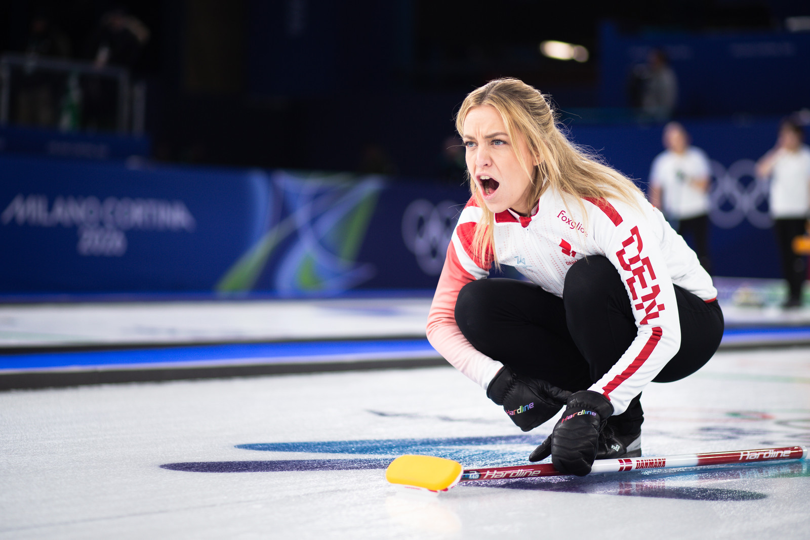
Denmark (Designer: Foxglide; Best Colour: Red)
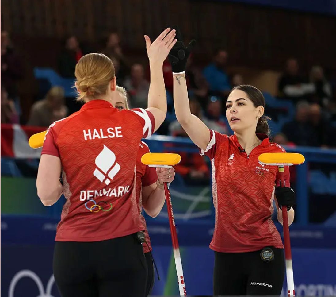
I’m not sure why more curling jerseys don’t use texture to their advantage, but the Danes always have great jerseys, and Foxglide always delivers on the biggest stage. It’s very subtle, but the “wavy leaf/flame/whatever” pattern really works, making these jackets stand out in a field of solids. Add in the Olympic Torch-inspired logo, the full-colour Olympic rings on the back (!), the white gradient side-stripe and the Danish flag integrated on the one shoulder, and these are really working. I also really love that they included the Milano Cortina logo on the right chest, a nod to soccer jerseys that often have tournament identifiers. I couldn’t fully get there with the “DEN” on the one shoulder, especially when on the jacket it was pushed to halfway down the sleeve and looked a bit awkward, but overall these are just a perfect example of how to be a little bit busy but not distracting. I would’ve loved to see a return of the black jackets from 2022, though.
Switzerland (Designer: Craft; Best Colour: White)
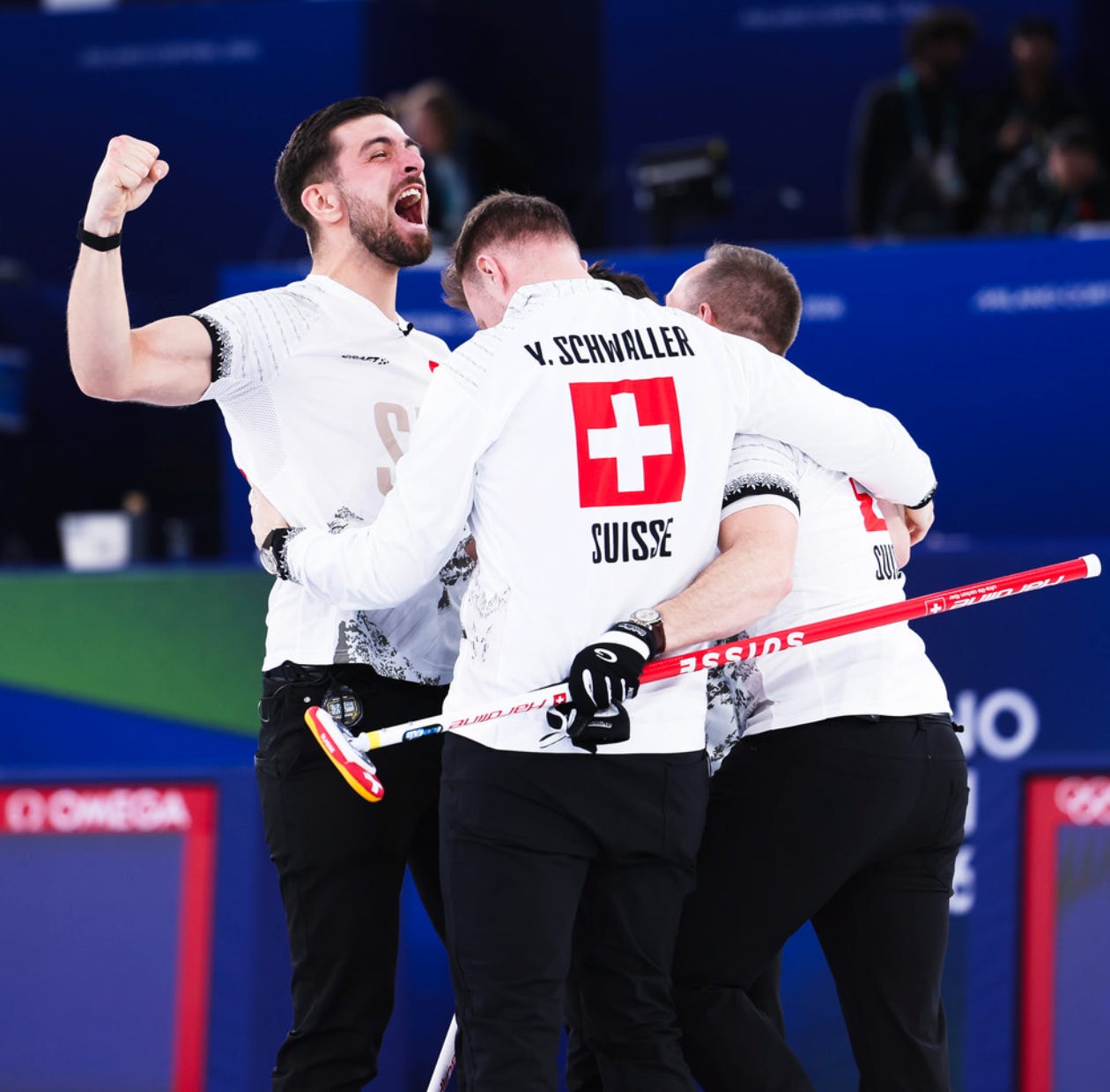
I wanted to put these in second, I really did. I LOVE that they were designed by Mr. T himself, Benoît Schwarz-van Berkel. I love so many of the details on them. These had just about everything you’d want: the Swiss Alps incorporated tastefully, the national flower of edelweiss ringing the shoulder yoke and sleeves, and the back is just perfectly done with a classy font and a giant Swiss flag that really stood out, especially on TV. I wasn’t in love with the “SUI” wordmark on the front and I thought it really washed out on the red jacket, which wasn’t nearly as nice in general. The white jacket is definitely a top-3 piece overall, but the red jacket was sorta mid-pack and that’s why I had to leave the Swiss just behind my number 2, who had consistency across all three of their colours.
Canada (Designer: Goldline; Best Colour: White)
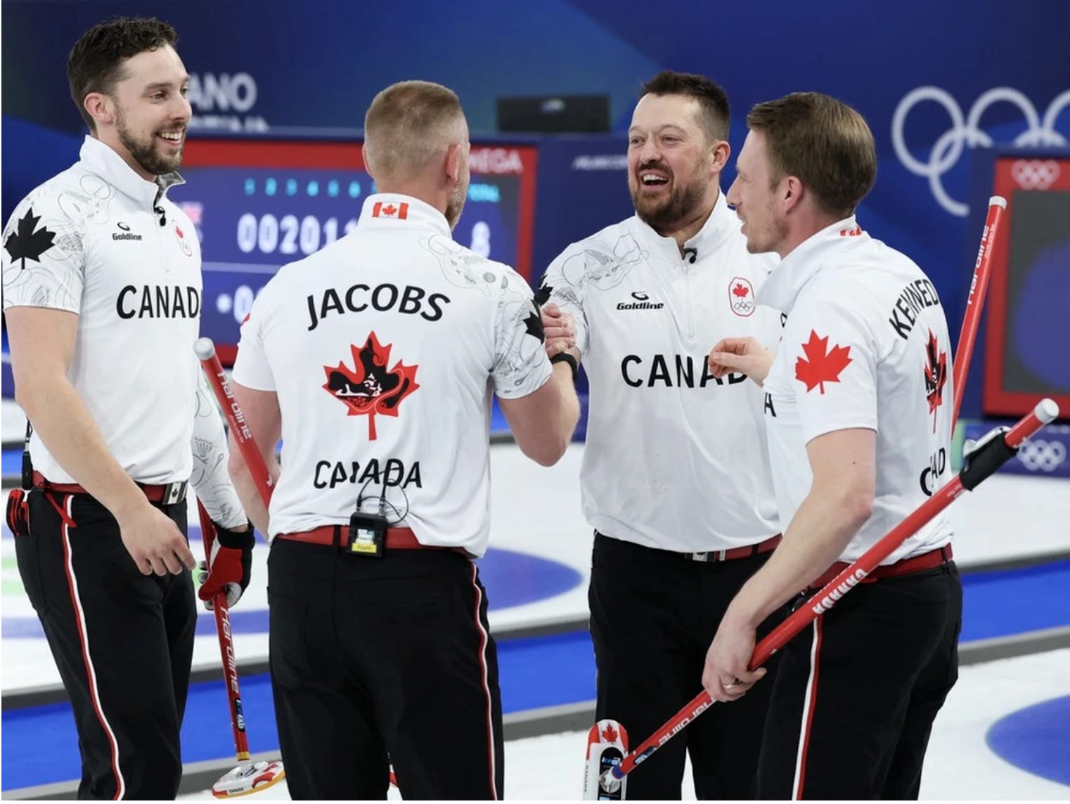
White jackets really had their moment at this Olympics, but I can’t help it if the designs tended to dazzle best on a white canvas. That said, I liked all three Canada colours (I also love that they even had three in a field where most had two) and that’s why they just barely edge out the Swiss here (I would put the Swiss white ahead of any Canada jacket, but the red doesn’t match up). There was lots to love about these Canada jackets, from the gorgeous Indigenous maple leaf design on the back and the accompanying hummingbird design on the sleeves, to the contrasting colour on the inner collar (you can see it just a bit in this photo on Brett but it really looks nice in person). The Canada Olympic Committee just also has such a clean, soccer-inspired logo that it looks great on the left chest. Keeping it out of the top spot? I haven’t been enamoured with this “CANADA” font across the chest, something we’ve seen on several Canada jackets this quad. The jacket has (by my count) 5 maple leaves on it, and says “Canada” on the back. It feels a little like overkill to me and takes away some of the cleanliness. On some level, when you’re the country where curling means the most, you have to step it up, and Goldline did here.
Germany (Designer: Dynasty; Best Colour: Black)
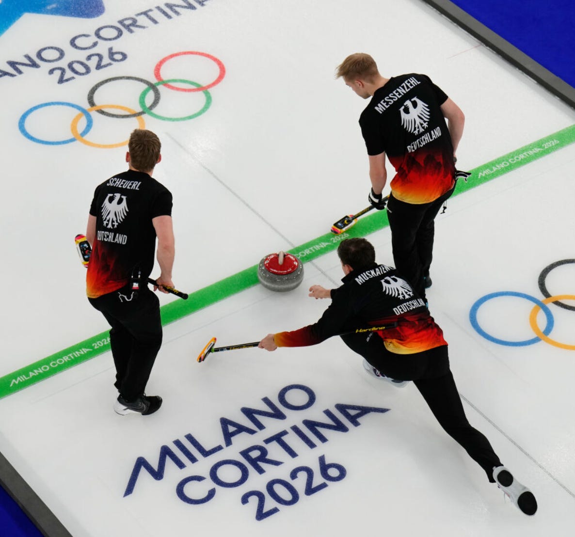
Oh baby. Oh babyyyyyy. You can give me these any day of the week and twice on Sunday. Absolutely as good as it gets. This was Dynasty’s only entry in the field and they knocked it out of the park, as I have the Germany blacks in at #1 in the field and the Germany whites in at #2, so it’s just annihilation across the board. The font is crisp, the German Eagle logo looks so bold and crisp on a curling jacket, and using the nation’s flag colours to create this sorta fire-and-brimstone look emanating from the bottom of the jacket was absolutely top-class. Throw in the German soccer-inspired Eagle shield on the front, no parts that don’t contribute to the whole, and we are going all the way in. That link also gives you a sense of how good the whites looked, with a pink-and-peach combo for the flames/mountains/whatever that really was a unique and fantastic colour choice for curling and made Germany stand out in their first appearance in the Games since 2014.
So there you have it. Overall? I think across the board we did better than 2022. There weren’t too many kits that were outright bad, and some of the new players in the field (Estonia, Germany) acquitted themselves very well. I’ll see you again in 4 years for the most important article in curling. Thanks for reading, and feel free to share the uniforms you liked best in the comments.
The 2022 designs by Kevin Hurrie for Dynasty were far superior to this year's kit from Goldline. Also, the racing stripes on the Men's pants were too retro. Kept looking for the snaps on the bottom. At least they didn't make the women wear those. And the whole Lululemon look was a total fail.
Great list. But we’d be remiss not to mention how killer the 🇨🇦 RCMPants were!